 As an arranger, I try to make my scores look as beautiful as possible. I really like a good layout. My arrangements are made with the music notation software Finale. But I definitely do not use its standard layout, because for me that layout looks rather bad.
In my view, the music publisher using the best layout in vocal scores is the Oxford University Press. Here is an example from the book In the mood:
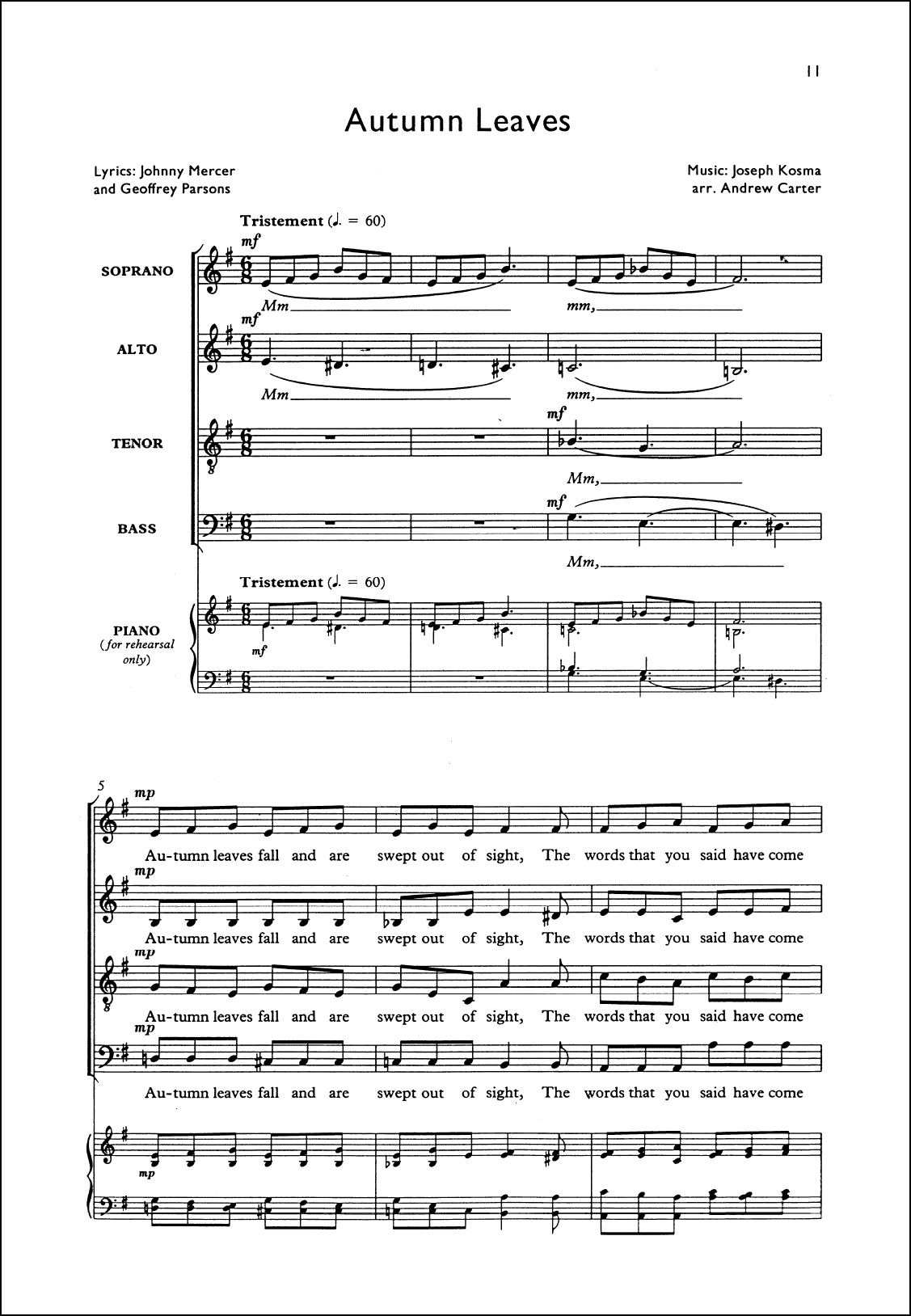
Why does this page look so much in harmony? In the layout the following settings are used:
- The title, the credits and the page numbers are in a sans serif font. In this case, Gill Sans is used. This is a typical British sans font, created at the early days of the twentieth century, but with timeless beauty.
- The staff names, lyrics and the expressions however are set in a regular serif font. To be precise, this is Plantin, a font with a nice italic and a nice bold as well.
- The lyrics have the right size in comparison to the notes.
- The sounds (with this I mean the meaningless words) are set in italics. In this way, singers can easily distinguish between lyrics and sounds.
- In the score, the graphic elements are similar in thickness. For example, the slurs are as thick as the ties. The staff lines, the bar lines and the word extensions are all similar in thickness. All these choices help to make the score look in harmony.
- The piano part is made a little smaller than the choral parts. In this way, the accompaniment makes room for the vocals, for whom the score is basically intended.
- The measure numbering is on the top left of each system, where is doesn’t collide with other elements and can easily be found at all times.
- The marks for dynamics are put above the staffs, a little to the left of the first note to which they apply. (For instrumental parts, it’s common to place the dynamics below the staff, straight underneah the first note to which they apply. But in choral parts there is little room below the staff, because of the lyrics.)
Not all publishers appreciate such a beautiful layout for their vocal scores. Let’s have a look at the arrangements of Hal Leonard, the biggest music publisher of the world. Below is a representative example, an arrangement by Kirby Shaw (the arranger that is sung the most in the world):

How this score looks messy in comparison to the score at the top of this page! In the Hal Leonard arrangement the following choices are made:
- The basic font is Times New Roman, a dull serif font.
- For the title, a different font is used than elsewhere. This font is Futura bold italic. (In the designer’s world, using bold and italics at the same time is considered bad habbit, because there is seldom need for both at the same time.)
- In the credits, lowercase letters are combined with words in capitals. Designers consider this to be one of the ugliest choices you might make. It is creating a screaming layout; it’s the same thing you see in lowbrow tabloids.
- The lyrics below the notes are set in bold. Because of this, the thickness of the lyrics is higher than other elements on the page.
- There is a lot of information on the page that could have been put elsewhere. The indication above the title could have been left out. The ‘Performance time’ would have suited more at the end of the score. The indication ‘Do not photocopy’ could have been on the next page. The mention of other versions of the arrangement on the bottom left side is not really relevant on this spot. That information might have been moved as well.
- In the piano part, there are chords. These come in hand for the pianist. But the chords are not really necessary in the score. The score is mainly meant for the singers. And to them, mostly the chords are not a big help. For a piano player, it’s no big deal to write down the chords from the notes in the score. In short, the chords could have been left out as well, or might have been put in an appendix.
- There are page numbers above each bar. It would have been sufficient to have one on each system.
- And apart from all this, there are a couple of details in the score which I really don’t like. Sorry for nit-picking. The heads of the notes are unnecessarily large. But on the other hand, the rehearsal mark are too small, because it should really stick out. The brace for the piano part looks strange. Why are the indications ‘Soprano’, ‘Alto’, ‘Tenor’ and ‘Bass’ put above and below the staff and not before the staff, as it is common? And I don’t understand why there is such a gap between the key and time signatures.
One might get the impression that Hal Leonard deliberately chooses for a messy layout. As if they want it to look like a billboard, in which each and every corner is used to give information and to do recommendations. It is hurting my eyes as well as my designer heart.