 Now and then students from the conservatory ask me what settings I’m using for the layout of my scores. In the past twenty years I slowly developed my view on that. I’m happy to explain which choices I make.
My scores are made using Finale, but Sibelius can be used equally good to create a really good layout. Let’s have a look at the first page of my arrangement of Pipes of peace by Paul McCartney:
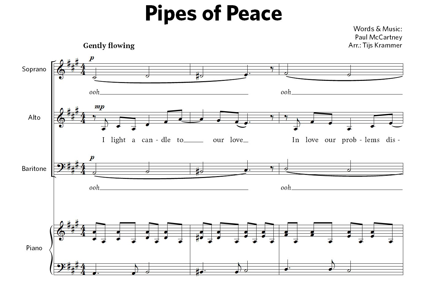
Below, we will focus on different parts of the score. By clicking on the pictures, you can see them in more detail.
Fonts

One of the fundamental choices which determines to a high extend the look of the score are the fonts that are used. A lot of modern choral music is published using fonts without serifs (so-called sans font). Personally, I prefer to use fonts with serifs. These are more legible (that’s why novels are generally published using serif fonts) and it creates more quietness on the page. For the titles, the credits and the staff names I’m using a sans font (just like it’s often done in books).
As a serif font you can better avoid the use of Times New Roman, because the result will be kind of boring. More beautiful are fonts like Georgia or Plantin, or Google fonts like Poly or Droid Serif. Nice sans fonts to use are Gill Sans or Open Sans by Google. By the way, for my own arrangements I’m using professional paid (rather expensive) fonts.
Try to avoid using more than two fonts (plus their italic counterparts), to avoid clutter on the page. Here is another hint for the use of fonts: don’t put the credits in the upper right corn in capitals. That will look shabby and blatant.
Lyrics
 As pointed out above, for the lyrics underneath the notes I’m using a serif font. This letter is relatively large, so its legibility will be high. (The drawback is that each system will only contain a relatively small number of bars.)
Meaningless sounds (like ooh and dah) are in italic in my scores. This is also adding to the legibility of the score.
Widths
One of the basic layout principles I’m using is that all elements on the page should be more or less equal in width. This results in a nice quiet overall look on the page. All lines have the same width and the letters and symbols are equal in width.
In the pictures above you can observe that the lines of the staffs, the stems, the barlines and the word extensions have the same width. Furthermore, the letters (except for the bold ones) are on average as bold as the lines. Furthermore, the graphic elements, like the accidentals, are comparable in width.
Placements of elements
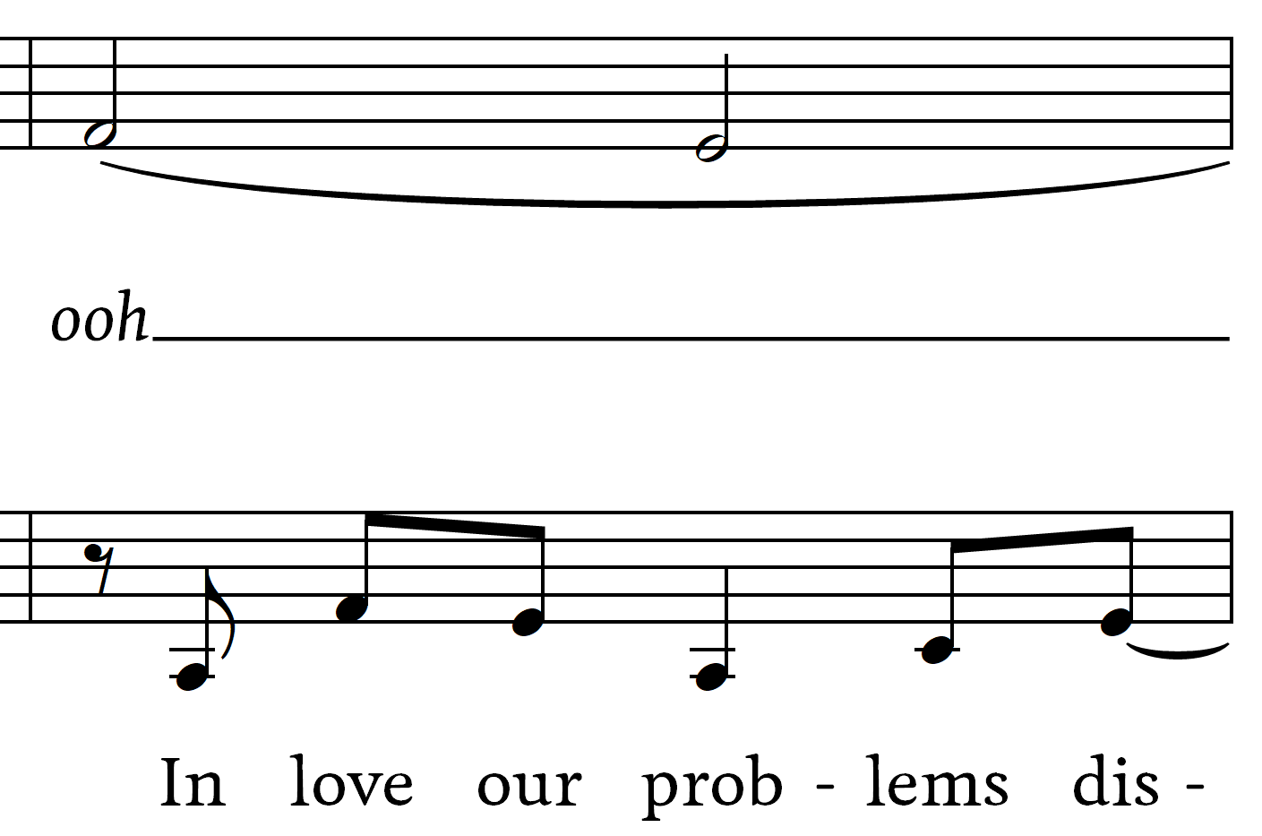
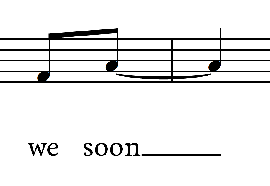 Now let’s have a look at the layout of the musical elements. Most software for music notation is placing lyrics a little differently from how I prefer it. Underneath a regular note lyrics are centered. Underneath a tied note however lyrics are on default placed left aligned. In this example, this would mean that the “s” of the word “soon” would lie straight below the note. Instead I’m choosing for these lyrics to be centered as well. This choice adds in creating a visually overall feel. (And in addition otherwise it might happen – here it’s gets to be kind of technical – that the lyrics is centered in a staff while being left aligned in another staff where there is a melisma, resulting in two words that start at the same time but are not align horizontally.)
Stems
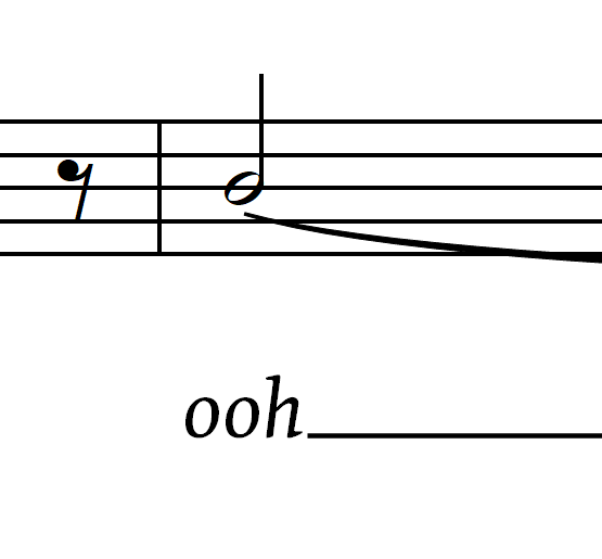 Concerning stems I have another preference. The usual way of notating is that of notes that fall on the middle line the stems are pointing downward. But these stems then tend to collide with the lyrics underneath the notes. That’s why I prefer these stems to point upward.
Dynamics
 Dynamic markings I’m handling differently from the regular way as well. In most scores dynamics are shown exactly below the note they apply to. However, in vocal scores, there is often lyrics underneath notes. That’s why I’m putting dynamic markings above the staffs.
Furthermore, I’m putting the dynamics a little before the note, i.e. shifted to the left. The reason for this is that above the staff there might be lyrics of the upper staff.
As much as possible I’m placing dynamics on a fixed height above the staff.
Ties and slurs
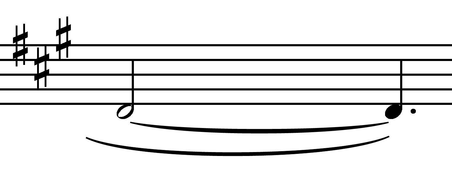 In vocal scores, ties and slurs demand for special attention. Most software for music notation is aimed at instrumental music and in these kind of notes ties are mostly short and slurs are long. That’s why ties are made thin and slurs thick. In vocal music however, slurs are not used to indicate legato, but to indicate a certain syllable belongs to multiple note. Thus, in this kind of music, the meaning of the two kind of bows is not very different. That’s why I’m making the ties and slurs equal in width.
In vocal music, regularly there is both a tie and a slur on a note. In those cases, I choose to let the bows go on the same side of the notes when possible. The end points of the slurs lie exactly underneath those of the ties. The distance between the end points of the bows equals the distance between the staff lines.
Regarding to the layout of the ties and slurs: in my scores, the endings of them are not very thin, because if music is printed on a laser or inkjet printer these tend to get rather fragile and serrated. The width of the endings is just a little below that of the staff lines.
Measure numbers
 Measure numbers can best be put on the left above each system. In some publications, measure numbers are shown below each barline, but this causes too many items on the page. Other publications have the measure numbers shown each five bars. The disadvantage is that the numbers do not have a fixed spot and you have to search for them all the time.
I choose to notate the measure numbers using a serif font in italics. But other choices are equally good.
Rehearsal marks
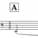 For efficient rehearsing, rehearsal marks are practical. For these, I’m using the serif font, bold and rather big. I’m putting a frame around it, making sure the marks really stand out on the page. The left side of the indication is aligned with the barline. If there is no barline – at the start of the system – the left side is aligned with the first note of the music.
Other choices
Here are some more choices I make concerning the layout:
- The noteheads are relatively small. (Smaller for example than in Finale’s Engraversfontset and Sibelius’ Opus.)
- In triplets there is always shown a hook, even when the triplet is over notes with a beam. The number in the triplet sign is bold and rather small. The hook is always horizontal and the hook is a little broader than the notes the triplet is belonging to.
- Staff names are centered.
- After the first system, there are no names for the staffs anymore, not even abbreviations. In an orchestral score, the abbreviations are indeed necessary. But in a vocal score, they aren’t really practical, because the number of staffs is limited. The staff names are only shown when the staffs are changing.
- The page numbering is in the sans font. On the odd pages the numbering is aligned to the right and on the even pages to the left. Next to the page numbering is the title of the arrangement.
- Indications above the staffs, like crescendo en ritenuto, all start with a capital, and are put on a fixed height above the staff.